Regístrate gratis y sigue viendo prompts sin límite.
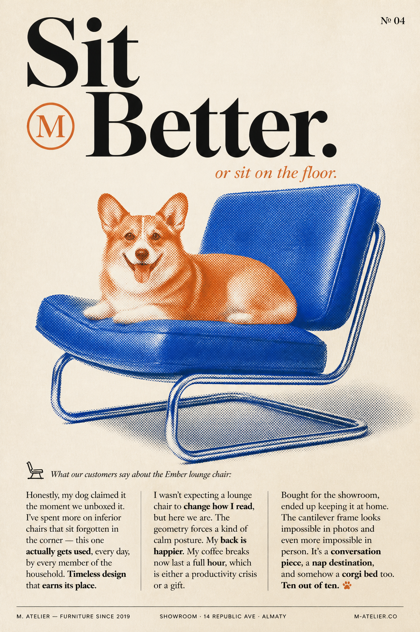
Reframe this concept as: vertical magazine-editorial visual poster in the aesthetic of a high-end visual design magazine spread. Clean paper-textured backdrop with a duotone photo-collage main subject, polished serif typography, and multi-column magazine-editorial body text. Mood of a high-end furniture publication (Cereal, Apartamento, Dwell, Kinfolk aesthetic).Canvas: Vertical 2:3 visual poster. Backdrop is warm off-white cream paper with delicate grain and faint halftone dot texture overall — feels tactile, printed, magazine-like. A small page-number "№ 04" in small uppercase serif sits in the top-right corner.Main headline (top of visual poster, large sophisticated serif, deep charcoal-black): Stacked on two lines, powerful high-contrast serif with sophisticated terminals (like Tiempos, Canela, or Playfair Display Black): "Sit / Better." The word "Better" has a small square logo-badge nested inline before it — a minimal "M" or circular glyph in a single accent color, scaled to match the x-height of the lowercase letters (like a brand monogram).Italic serif sub-headline (right below, smaller, warm rust-orange color): "or sit on the floor." Slightly offset to the right, playful tonal counterpoint to the powerful headline above.Main visual (dominant, middle 60% of the visual poster): A duotone-treated photographic layout of a small Pembroke Welsh Corgi (ginger/red and white short-coat, pointed ears, classic corgi face, stubby legs, tongue slightly out, relaxed happy expression) lounging comfortably on a modernist mid-century lounge chair — a generic Bauhaus-inspired cantilevered chair with a chromed steel frame and two leather-upholstered cushions (seat + backrest). The chair is rendered in a powerful cobalt-blue duotone, the corgi rendered in warm rust-orange / copper duotone — the two subjects overlapping and intersecting in a playful graphic layout, as if screen-printed in just two ink colors. Subtle halftone dot pattern throughout both elements gives an authentic printed-magazine feel. The chair and dog cast gentle dark cast-shadows onto the cream paper backdrop. The corgi is photographed with natural comfort, clearly enjoying the chair's visual design.Three-column body text block (bottom third of visual poster, small justified serif, deep charcoal):Above the columns, a small italic serif intro line with a delicate icon (a small chair glyph or brand mark): "What our customers say about the Ember lounge chair:"Then three narrow text columns of justified serif body copy, each 4–5 lines:Column 1: "Honestly, my dog claimed it the moment we unboxed it. I've spent more on inferior chairs that sit forgotten in the corner — this one actually gets used, every day, by every member of the household. Timeless design that earns its place."Column 2: "I wasn't expecting a lounge chair to change how I read, but here we are. The geometry forces a kind of calm posture. My back is happier. My coffee breaks now last a full hour, which is either a productivity crisis or a gift."Column 3: "Bought for the showroom, ended up keeping it at home. The cantilever frame looks impossible in photos and even more impossible in person. It's a conversation piece, a nap destination, and somehow a corgi bed too. Ten out of ten. 🐾"Each column has a few bolded phrases in black for emphasis, scattered throughout the paragraphs (as shown above). Clean hierarchy.Bottom strip (very thin bar at the very bottom of the visual poster, small uppercase tracked sans-serif): Left-aligned: "M. ATELIER — FURNITURE SINCE 2019" Center: "SHOWROOM · 14 REPUBLIC AVE · ALMATY" Right: "M-ATELIER.CO"Palette: warm cream paper backdrop, cobalt-blue duotone (chair) #2E5BFF, warm rust-orange duotone (corgi + italic sub-headline) #D1623A, deep charcoal-black typography #1A1A1A. Typography: sophisticated high-contrast serif for headline and body (Tiempos / Canela / Playfair), italic serif for accent lines, polished uppercase sans-serif for footer meta. Mood: high-end magazine-editorial, playful but polished, like a visual design magazine spread or a curated furniture catalog. Finish: tactile paper grain, delicate halftone throughout, gentle cast shadows, print-magazine feel. Awwwards / Behance / Cereal-magazine-quality magazine-editorial visual poster, 4k portrait image-oriented.