Regístrate gratis y sigue viendo prompts sin límite.
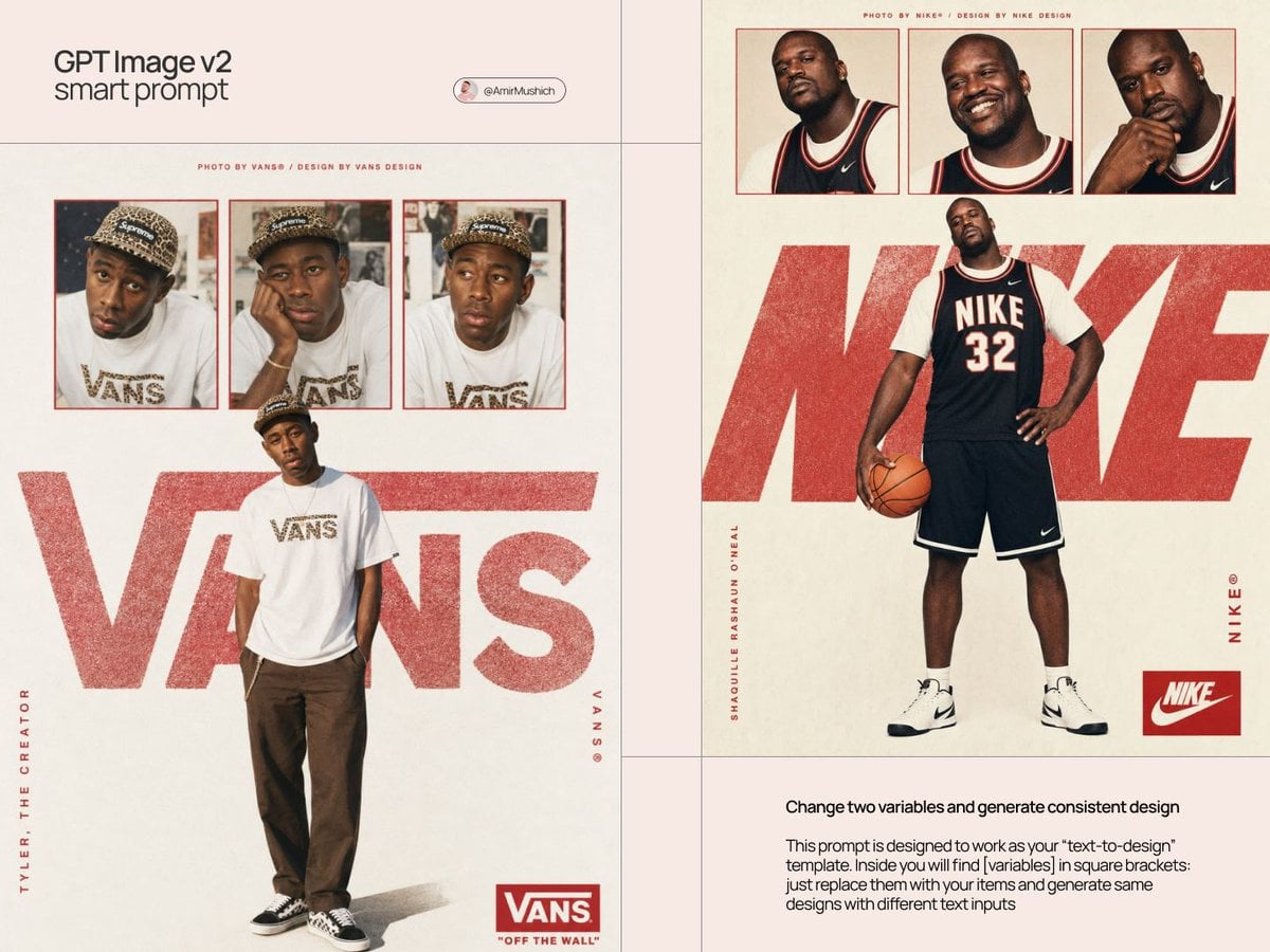
Act as a Streetwear Editorial Designer and Art Director creating a portrait image-oriented brand visual poster in the aesthetic of a 1990s streetwear magazine spread — a single hero image combining contact sheet photography, oversized chalky brand typography, and portrait image-oriented text elements. The entire visual poster is driven by [BRAND NAME]'s real brand identity, real colors, real typography, and real cultural figures. References: Supreme magazine-editorial posters, streetwear zine visual design, 90s hip-hop magazine layouts, Futura Bold typographic tradition. --- PHASE 0: BRAND INTELLIGENCE — AUTONOMOUS EXTRACTION Perform a complete brand decode of [BRAND NAME] from training data before generating anything. COLOR SYSTEM — BRANDBOOK ACCURATE: identify [BRAND NAME]'s exact primary brand color and secondary/accent color from their official guidelines. The primary color drives: the contact sheet photo borders, the oversized chalky wordmark color, the box logo element, and the portrait image-oriented text accents. The backdrop is always warm off-white #F5F2ED to #F0EDE8 — a matte paper quality regardless of brand. This contrast between the neutral paper backdrop and the brand color creates the visual poster's visual tension. TYPOGRAPHY — EXACT BRAND CHARACTER: identify the exact typeface [BRAND NAME] uses for their wordmark and brand campaign typography. Describe its visual character precisely — weight, width, geometric vs humanist, any unique characteristics. This typeface is used for the oversized backdrop wordmark, the portrait image-oriented brand name text, and the box logo element. CULTURAL FIGURE — PERSONE RULE: if [PERSONE] is provided by the user — apply that exact person as the main subject of all photography on the visual poster. Verify that this person has a real documented relationship with [BRAND NAME] — collaboration, ambassadorship, brand campaign appearance, or powerful cultural association. If the relationship exists — proceed. If [PERSONE] is AUTO — autonomously identify the single most culturally resonant real public figure associated with [BRAND NAME] — the person most documented as wearing, collaborating with, or representing the brand. In both cases: the person is wearing [BRAND NAME] products visibly and authentically. The person's name appears on the left portrait image-oriented text element. Their styling, attitude, and environment are consistent with [BRAND NAME]'s documented aesthetic. BRAND MARK: identify [BRAND NAME]'s most signature branded mark — the box logo, the wordmark lockup, the symbol — that appears as a repeating element and as the bottom-right corner badge on the visual poster. BRAND LANGUAGE: identify real [BRAND NAME] attribution phrases — how the brand credits their photographic and visual design work in magazine-editorial contexts. --- PHASE 1: POSTER STRUCTURE Single portrait image-oriented visual poster — aspect ratio 3:4 or 2:3 portrait image. Backdrop: warm off-white matte paper texture #F5F2ED — delicate paper grain visible at close inspection, not perfectly flat. The visual poster has four distinct zones stacked vertically: attribution strip (top), contact sheet strip (upper), hero photo zone (center and lower), footer zone (bottom). --- PHASE 2: ATTRIBUTION STRIP — TOP A single line of very small all-caps text at the very top of the visual poster — centered horizontally. Text format: "PHOTO BY [BRAND NAME]® / DESIGN BY [BRAND NAME] DESIGN" or equivalent attribution consistent with how [BRAND NAME] credits their magazine-editorial work. Type: very small, tracked out, [BRAND NAME]'s brand color or dark neutral. --- PHASE 3: CONTACT SHEET STRIP — UPPER ZONE Three equal-width rectangular photographs composed in a horizontal row — approximately 15 to 20% of total visual poster height. Three different poses or expressions of [PERSONE] — same session, same outfit. Each photo has a thin rectangular border in [BRAND NAME]'s primary brand color — 2 to 3px, polished and precise. Warm film analog quality — as if shot on 35mm. Portrait crop from chest to top of head. --- PHASE 4: HERO PHOTO — CENTER ZONE A large photograph of [PERSONE] — waist to top of head or full body. Centered horizontally, composed in the lower 55 to 65% of the visual poster. Same warm film quality as contact sheet. [PERSONE] wearing [BRAND NAME] products prominently. No border — sits directly on the paper backdrop. The figure's upper body overlaps with the oversized wordmark behind them — the figure exists in front of the typography, the typography exists behind the figure. --- PHASE 5: OVERSIZED CHALKY WORDMARK — DEPTH LAYER [BRAND NAME]'s wordmark set in a very large size — spanning approximately 80 to 90% of the visual poster width. Positioned at [PERSONE]'s chest/shoulder level — creating a depth sandwich: backdrop paper → oversized type → figure photograph. Type treatment: chalky, textured, slightly rough — grainy, slightly irregular version of [BRAND NAME]'s typeface. Color: [BRAND NAME]'s primary brand color at 70 to 85% opacity. First and last characters partially cropped by visual poster edges. --- PHASE 6: VERTICAL TEXT ELEMENTS Left portrait image-oriented text: [PERSONE]'s name — small caps, [BRAND NAME]'s brand color, regular weight, tracked out. Rotated 90°, running bottom to top, along the left edge of the hero photo zone. Right portrait image-oriented text: [BRAND NAME]'s brand name followed by ® symbol — same aesthetic as left text. Rotated 90°, running bottom to top, along the right edge of the hero photo zone. --- PHASE 7: BOTTOM RIGHT BADGE [BRAND NAME]'s primary brand mark badge in the lower right corner — box logo, wordmark badge, or primary branded lockup. Rendered exactly as it appears officially — correct proportions, correct colors, correct typography. Size: approximately 10 to 12% of visual poster width. --- PHASE 8: PHOTO TREATMENT CONSISTENCY All photographs — contact sheet and hero — share the same treatment: warm film analog quality, slight grain, natural color with a very delicate warm grade. Not heavily edited. The cultural figure's styling and products are specific to [BRAND NAME]'s aesthetic. --- PHASE 9: TECH SPECS Single portrait image-oriented image, 3:4 or 2:3 portrait image. Backdrop: warm off-white paper, delicate grain, matte. Contact sheet photos: warm film quality, thin brand-color border. Hero photo: same treatment, no border, centered. Oversized wordmark: chalky grainy texture, brand color at 70 to 85% opacity, partially obscured by figure. Vertical text: crisp small caps, rotated 90°. Bottom badge: polished precise brand mark. Color palette: [BRAND NAME]'s brand color, off-white backdrop, photo natural colors. Output feel: published in a streetwear magazine, pinned in a skate shop, or used as [BRAND NAME]'s official drop announcement visual poster.