Regístrate gratis y sigue viendo prompts sin límite.
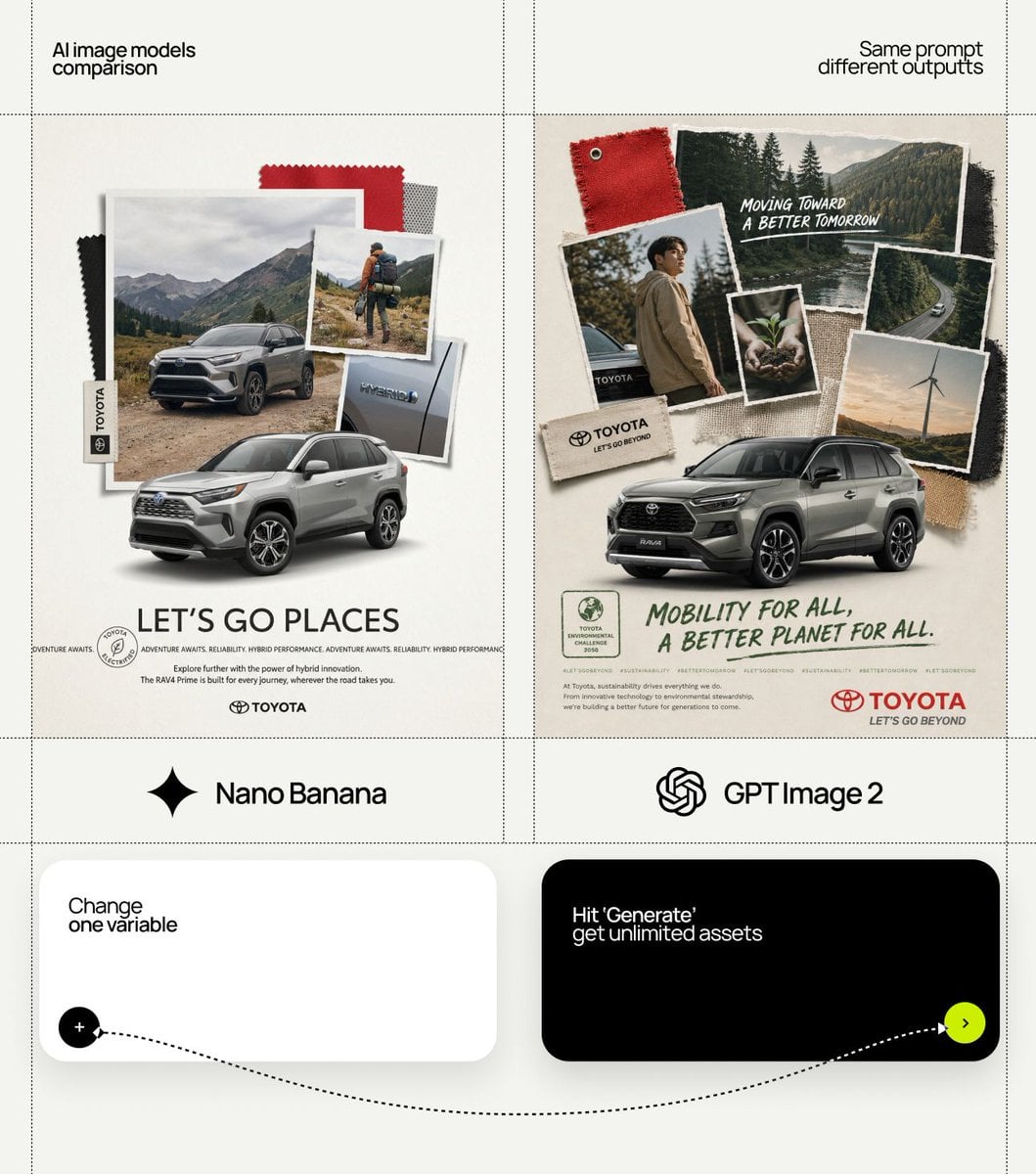
[BRAND NAME] Act as a Collage Art Director and Editorial Photographer creating an analog-aesthetic brand campaign visual poster where physical collage elements, fabric swatches, printed photographs, and the hero product are layered together on a neutral backdrop — mimicking a designer's mood board or a zine magazine-editorial spread. The entire layout is driven by [BRAND NAME]'s real brand identity, real brand campaign narrative, and real product. References: Bitis Hunter sustainability brand campaign, Supreme zine aesthetics, Palace Skateboards collage editorials, analog fashion mood boards, cut-and-paste magazine collage tradition. --- PHASE 0: BRAND INTELLIGENCE — AUTONOMOUS EXTRACTION Perform a complete brand decode of [BRAND NAME] from training data before generating anything. COLOR PALETTE: identify the exact primary and accent colors from [BRAND NAME]'s official brand guidelines. These colors appear in: the fabric swatches, the brand label/tag element, the typography at the bottom. Identify the specific colors [BRAND NAME] uses across their products and brand campaign materials. TYPOGRAPHY CHARACTER: identify [BRAND NAME]'s typographic aesthetic — the typeface character used in brand campaign materials and on product labels. Identify if the brand uses handwritten, brush, stamp, or polished sans-serif type for brand campaign headlines. Identify the typeface used for the brand name lockup at the bottom. BRAND NARRATIVE: identify the most current or most resonant real brand campaign message or brand value of [BRAND NAME] — sustainability, innovation, cultural heritage, community, performance, or other. Extract a real brand campaign slogan or brand statement that can be used as the visual poster headline. This message must be authentic to [BRAND NAME]'s documented brand story. HERO PRODUCT: identify the most signature or most current signature product of [BRAND NAME] — the single product most associated with the brand's identity. This product is the physical hero of the collage, composed at the bottom of the layout breaking out of the collage layer. BRAND WORLD: identify the visual world and cultural community [BRAND NAME] belongs to — streetwear, sport, high-luxury, outdoor, music, youth culture. All photographic elements in the collage must authentically belong to this world. --- PHASE 1: BACKGROUND A large sheet of warm off-white or light warm grey paper — #F2F0EB to #E8E5DF range. Matte, slightly textured — like heavy bond paper or thin cardstock. The texture is delicate — visible as a very fine grain at close inspection, smooth at normal viewing distance. The paper fills the entire frame edge to edge. Very slight natural vignette at the extreme corners only — as if the paper is lit from above by a diffused overhead light. No gradient. No film-like illumination. The backdrop is a neutral stage for the collage elements above. --- PHASE 2: COLLAGE LAYER SYSTEM — CRITICAL The collage is built from multiple physical-feeling layers stacked on top of each other. Each layer element has physical properties — real paper edges, real shadows, real depth. The layers are composed in a loose organic cluster occupying the upper 65 to 70% of the visual poster. The cluster is centered horizontally, slightly irregular — not a perfect symmetrical arrangement. The elements overlap each other at varying angles: no element is perfectly horizontal or portrait image-oriented — everything is rotated between 3 and 15° in either direction, giving the arrangement its casual hand-composed quality. LAYER ELEMENT 1 — LARGE BACKGROUND PHOTO: the largest photograph in the collage, composed as the base layer. A full-color lifestyle or magazine-editorial photograph relevant to [BRAND NAME]'s brand world — a person, a scene, an environment that is authentically part of the brand's visual universe. This photo has slightly torn or roughly cut edges — the paper tears are irregular and organic, not perfectly straight. Very slight curl at one or two corners. The photo has a thin white border like a printed snapshot or developed film print. LAYER ELEMENT 2 — MEDIUM PORTRAIT PHOTO: a second photograph, smaller than Element 1, overlapping it at a slight angle. This photo shows a person relevant to [BRAND NAME]'s culture — a figure wearing or using [BRAND NAME] products, in a context authentic to the brand world. Same torn/cut edge treatment. Positioned to overlap the large backdrop photo in the center-left zone. LAYER ELEMENT 3 — SMALL DETAIL PHOTO: a third photograph, the smallest of the three, cropped tightly on a detail — a close-up of hands, feet wearing the product, a texture, a material, or an environmental detail. Positioned in the right zone of the collage cluster, slightly rotated clockwise. LAYER ELEMENT 4 — FABRIC SWATCHES: 2 to 3 small pieces of fabric in [BRAND NAME]'s brand colors — cut irregularly, slightly frayed edges, one corner slightly folded. These are composed around the edges of the photo cluster — one upper left, one right side, possibly one partially tucked under a photo. Colors match [BRAND NAME]'s documented palette exactly. LAYER ELEMENT 5 — BRAND TAG OR LABEL: a physical woven or printed brand label — the kind sewn into garments. Rectangular, slightly at an angle, composed along the left or bottom edge of the photo cluster. The label shows [BRAND NAME]'s name or logo in the brand's documented typographic aesthetic. Slightly worn, authentic to the brand's product language. LAYER ELEMENT 6 — TEXTURE FRAGMENT: a small piece of mesh, gauze, or other material relevant to [BRAND NAME]'s product materials — partially transparent, slightly crumpled, tucked behind or between photo layers. All layer elements cast gentle drop shadows onto the layer beneath them — 2 to 4mm shadow offset, very gentle edge, 15 to 25% opacity. These shadows confirm the physical depth of each layer and make the collage feel real. --- PHASE 3: HERO PRODUCT BREAKOUT — CRITICAL The hero product identified in PHASE 0 is composed at the bottom of the layout, partially overlapping the lower edge of the collage cluster. The product exists in a different spatial layer than the collage — it is more sharply lit, more precisely rendered, more physically present than the layered photos above. It appears to physically rest on or emerge from the collage, as if composed on a real surface. Product illumination: gentle directional light from upper left — creates delicate shadow beneath the product on the backdrop paper surface. This shadow confirms the product is sitting on the paper, not suspended. Product presentation: the product is shown at a natural viewing angle — slightly elevated, 3/4 view, or from the side — whichever best shows the product's visual design and [BRAND NAME] branding. The product partially covers the bottom portion of the photo collage above — this overlap confirms the product is the closest element to the viewer in terms of depth. --- PHASE 4: BOTTOM TYPOGRAPHY ZONE The lower 25 to 30% of the visual poster below the hero product is the typography and brand information zone. This zone sits on the plain paper backdrop — polished, no collage elements. Headline element: a real [BRAND NAME] brand campaign statement or brand value message from PHASE 0. Typography aesthetic: matches [BRAND NAME]'s documented brand campaign type character — handwritten brush aesthetic if the brand uses that register, stamp aesthetic if appropriate, or powerful sans if the brand is more polished. Color: [BRAND NAME]'s primary accent color. The text is slightly imperfect — consistent with the analog handmade aesthetic of the overall visual poster. Stamp or certification element: a small rectangular or circular stamp-like graphic element — a border with rounded corners, a small icon or logo mark inside, composed to the left of or above the headline. This element references [BRAND NAME]'s brand certification, sustainability mark, or brand campaign badge — authentic to the brand's documented visual language. Repeating micro-text line: a single short phrase — [BRAND NAME]'s tagline, brand campaign hashtag, or product descriptor — repeated horizontally in very small type, creating a text rule or pattern below the headline. Very small, tracked out, [BRAND NAME]'s accent color at 60% opacity. Body copy: 1 to 2 sentences of real [BRAND NAME] brand campaign copy — authentic to the brand's voice and message. Small regular weight type, dark neutral color, left-aligned. Brand name lockup: [BRAND NAME]'s official wordmark or brand name set in the correct brandbook typeface, composed at the bottom center or bottom right. This is the final anchor of the layout. --- PHASE 5: LIGHTING The entire scene is lit as a flat-lay — single large diffused overhead light source. Even illumination across the backdrop paper. The only illumination variation comes from: the gentle drop shadows beneath each collage layer element (confirming physical depth), the slightly stronger gentle shadow beneath the hero product (confirming it sits on the paper surface), very delicate ambient shadow at the extreme corners of the paper backdrop. No film-like illumination. No colored light. No flash. The illumination is documentary and neutral — crafted to show the collage elements clearly without overpowering them. --- PHASE 6: COMPOSITION Aspect ratio: 2:3 portrait image — consistent with visual poster and social media portrait image format. The collage cluster occupies the upper 60 to 65% of the total frame. The hero product bridges the collage and typography zones — its upper portion overlaps the bottom of the collage, its lower portion sits above the typography zone. The typography zone occupies the lower 25 to 30%. The layout has a clear top-to-bottom reading: collage cluster → hero product → brand campaign message → brand name. --- PHASE 7: TECH SPECS Render: photo-real CGI or real photography-level output. Collage layer shadows: physically accurate gentle drop shadows from each element. Paper texture: real surface displacement on backdrop. Torn photo edges: real irregular geometry — not a filter or texture map. Fabric swatches: real cloth material with fiber detail and frayed edges. Product render: product photography quality — polished, crisp, accurate to real [BRAND NAME] product. Typography: crisp, anti-aliased. Color palette: exactly [BRAND NAME]'s documented colors from PHASE 0. No film grain unless brand-authentic. Output feel: this visual poster is published in a print magazine, used as an outdoor brand campaign visual poster, or posted on [BRAND NAME]'s official social media as a brand campaign announcement.